Since the introduction of their universal colour matching system in 1963, Pantone has been a key resource for graphic designers.
Their standardisation of colours allows designers around the world to communicate clearly about which colours to use.
Each year, Pantone tunes into global trends and influences to designate a “Pantone Colour of the Year”.
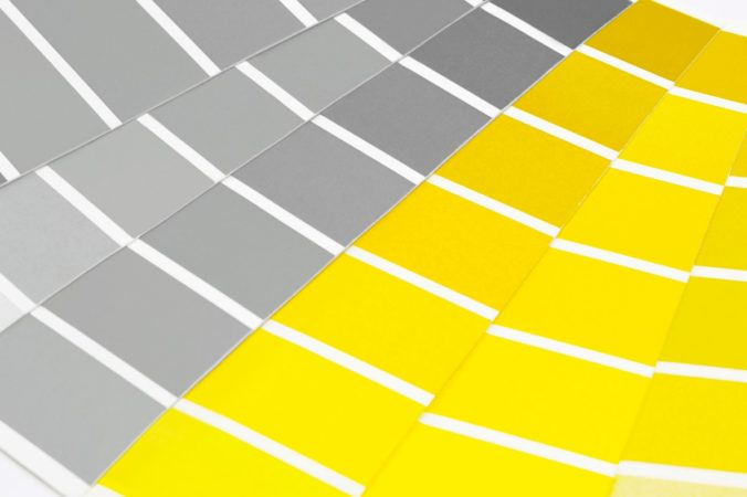
This year, they’ve actually chosen a pair of colours:
PANTONE 17-5104 Ultimate Gray + PANTONE 13-0647 Illuminating
Leatrice Eiseman, Executive Director of the Pantone Colour Institute, explains:
“The union of an enduring Ultimate Gray with the vibrant yellow Illuminating expresses a message of positivity supported by fortitude. Practical and rock solid but at the same time warming and optimistic, this is a colour combination that gives us resilience and hope. We need to feel encouraged and uplifted; this is essential to the human spirit.”
What does this mean in the real world?
Well, firstly, expect to see a few more yellow sofas and grey t-shirts in the shops!
It’s also a useful reminder of the importance of colour to our businesses and, more specifically, our brand identities.
Colours which resonate with your audience are always going to give you a better connection. For example, the bright, energy of yellow works well with younger generations (think Chupa Chups lollies). Grey is a more understated colour and great for brands targeting a wide ranging audience (such as Apple).
Colour is just one of many considerations when defining your brand identity. At Tomango, we’ll help you optimise every aspect of your brand to help you grow your business and get more of the customers you want. Visit our website to find out more: https://www.tomango.co.uk/